SaaS Design
Anatomic4D
I helped out with the user experience and design of an upcoming product, Anatomic4D, which aims to become a library of resources for dental students as well as an e-commerce store for dental models.
Design Brief
Plan out and create wireframes and mockups for a web-based platform in which students can purchase dental models, as well as browse articles and demonstrations from experts in the field
Timeframe
1 month
Target Audience
Dental Students
"We want to be presented as cutting-edge and technology forward as we need the students to trust that we are capable of producing high standards of products."
My Responsibilities
For all my tasks, I reported back to and occasionally collaborated with my supervisor, who is a graphic designer. I worked predominantly on True2Life's functionality.
Service Analysis
Defined and mapped out the user journey of True2Life's service, from entering the Anatomic4D hub to using the simulation
Wireframing
Created wireframes, highlighting the layouts for each page and providing innovative ideas to how certain experiences could be enhanced
High-fidelity Mockups
Developed and refined the interface over iterations to create an aesthetic, functional interface the properly conveys the company's image

Final Screens
Design Process
Defining the User Journey
I created a user journey map to fully understand the user experience, as well as the screens I needed to make

Creating the Layout
I created wireframes for all the screens required in True2Life, focusing strongly on intuitive navigation

Refining the Interface
I refined each design with a modern aesthetic and consistent styling
1. User Journey
Communicating with the boss and my supervisor, I created a basic customer journey map highlighting how a user would interact with True2Life services

2. Layout
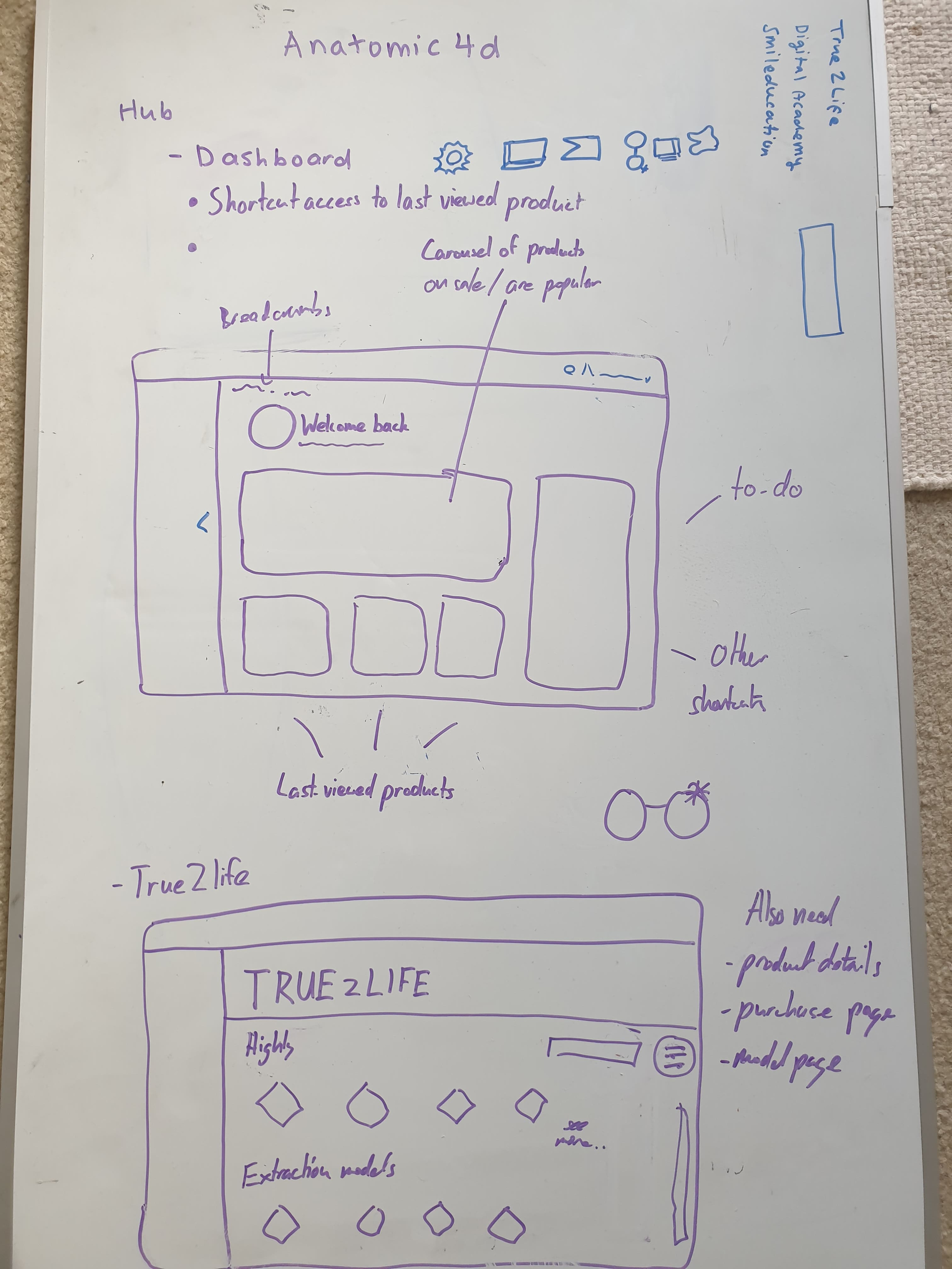
Whiteboarding
After defining the user experience, I collaborated with my supervisor in a whiteboarding exercise, where we sketched each of the screens and noted down important elements we needed to include, as well as the general layout of the hub.
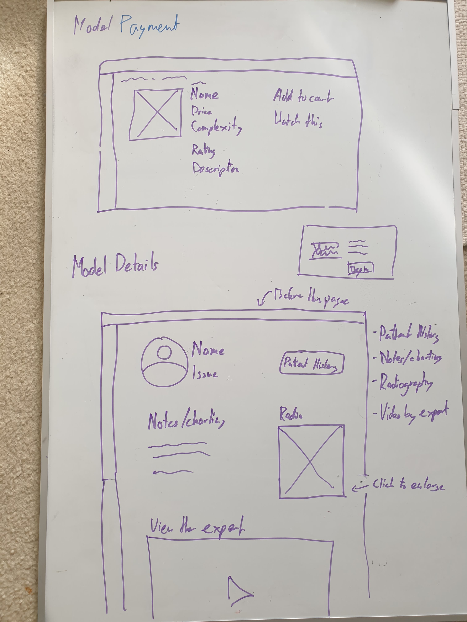
Wireframing
Following our whiteboarding, I proceeded to created a set of higher-fidelity wireframes in Figma. These wireframes were received well with few alterations. My supervisor commented on how intuitive the experience and navigation was, despite the fidelity still being quite low


3. Refinement
Early Iterations
Early iterations in the process were still fairly rough and bland. My supervisor commented on the "boxed-in" nature of the interface with the header and navigation bars.

Final Designs
Final designs of the interface include a more open layout, a patterned gradient background to create a modern feel, and more. I'll be going through some design justifications for screens below!

Final Screens
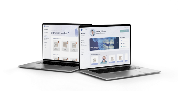
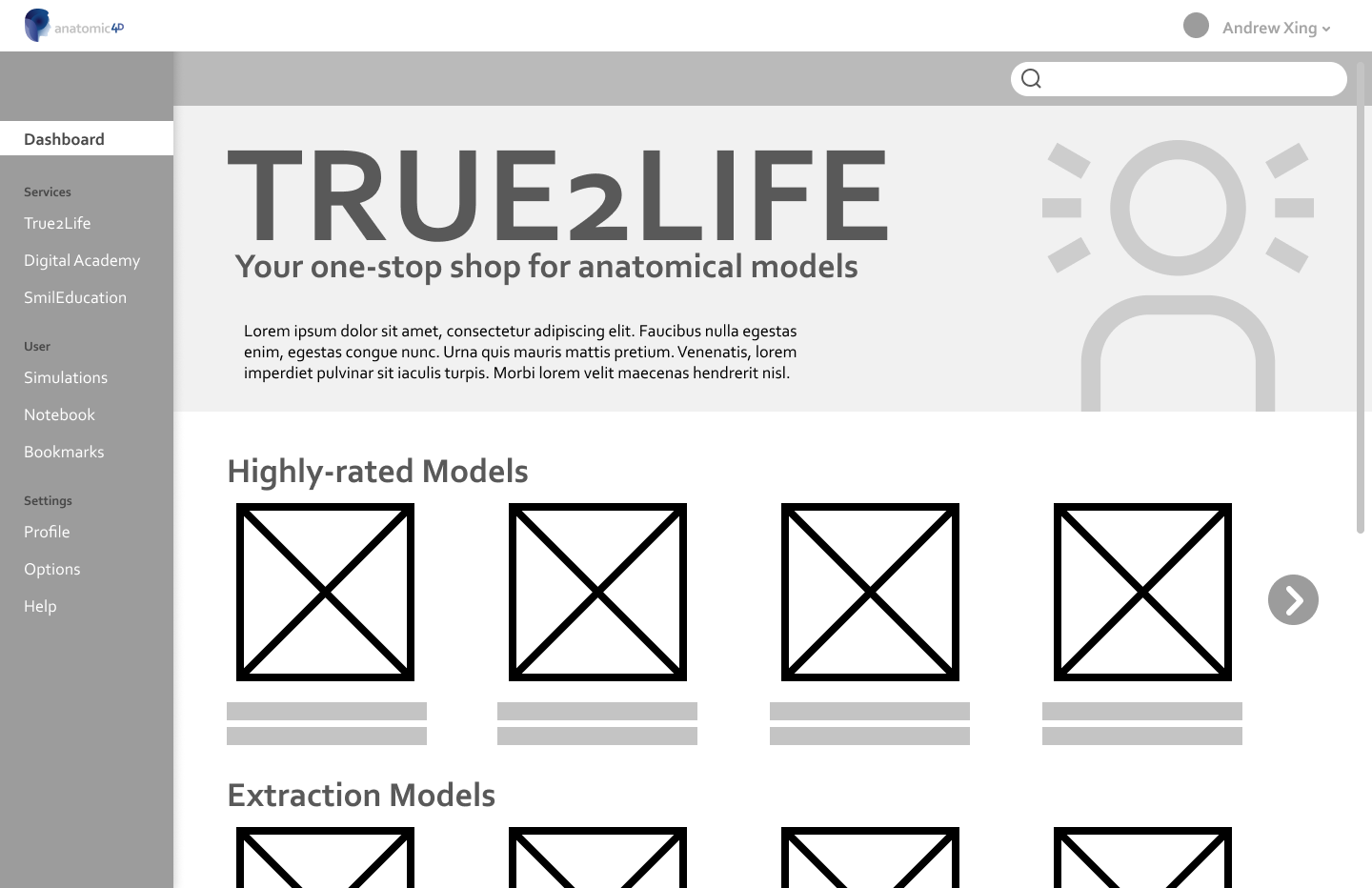
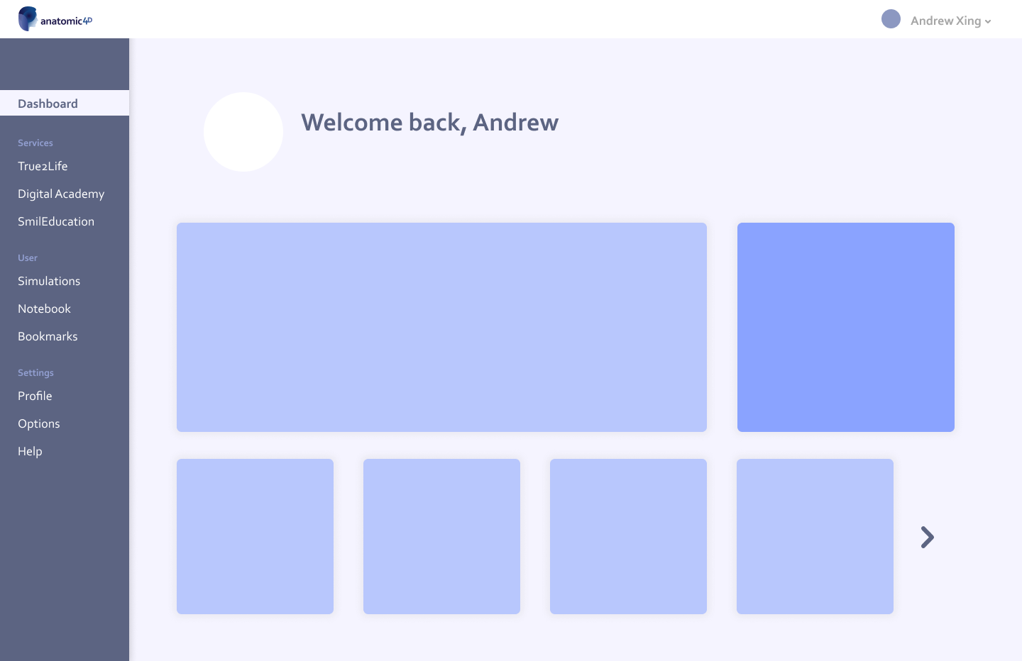
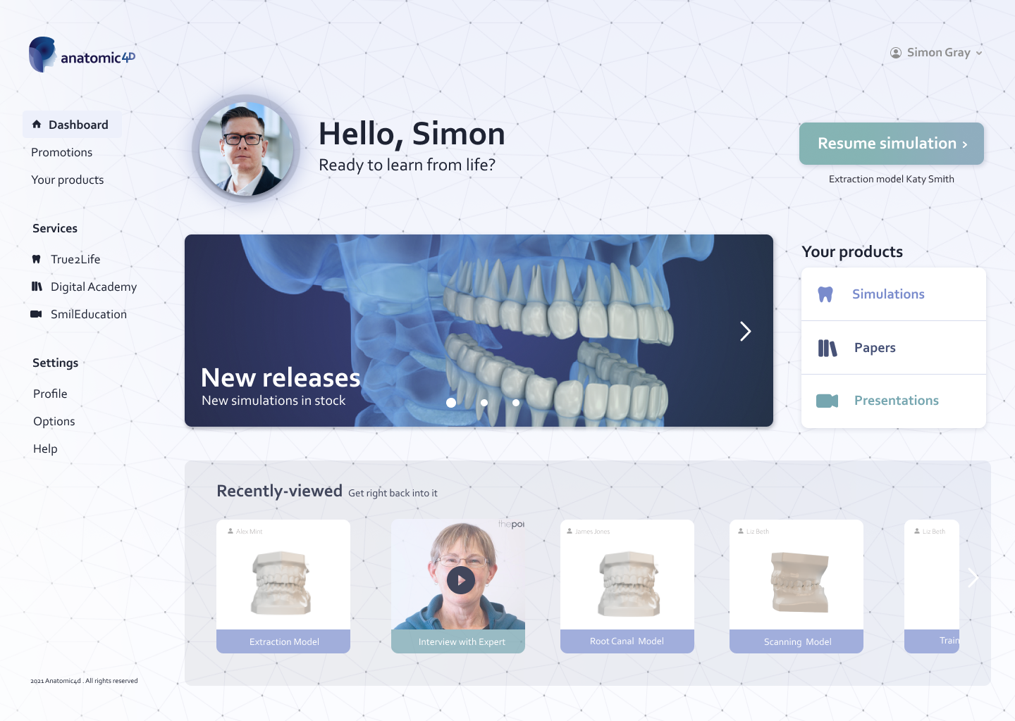
Dashboard
Users open up to an aesthetic, open dashboard, with fast access to the features they need to return to. Sections are separated clearly, and important elements stand out, contrasting with the light background.
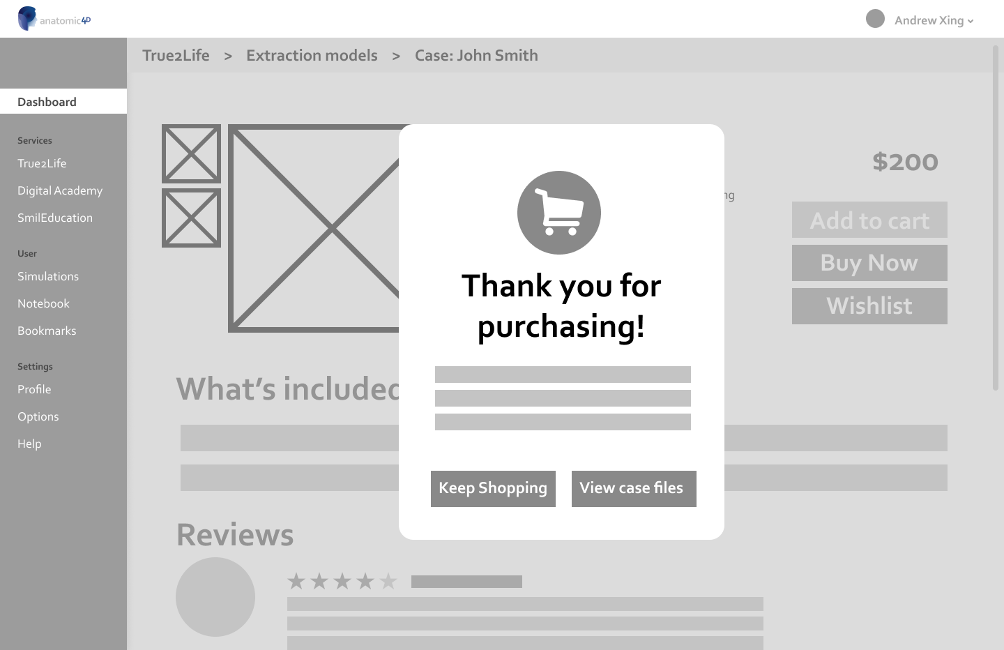
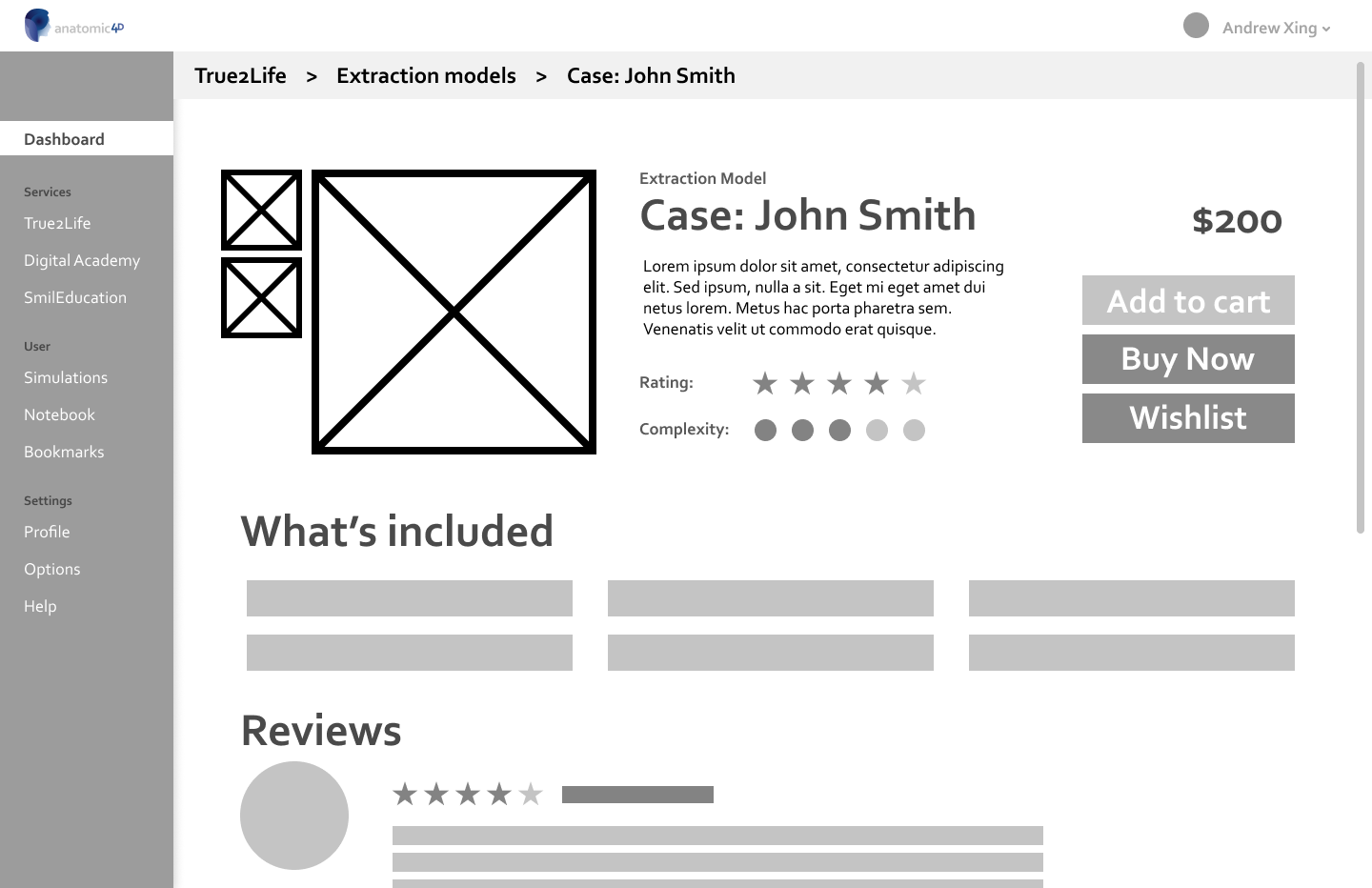
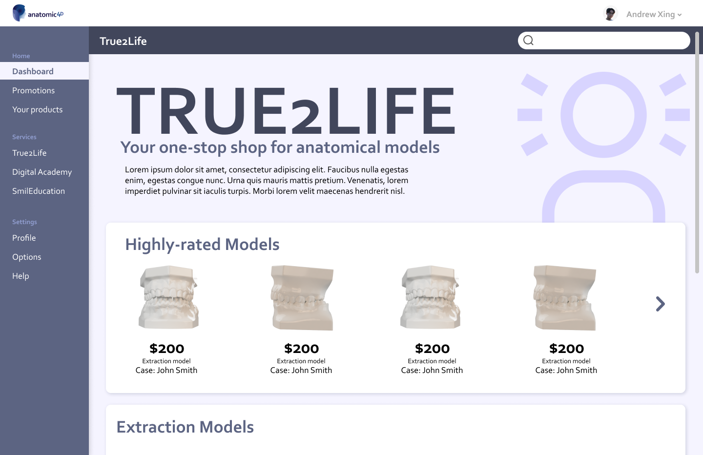
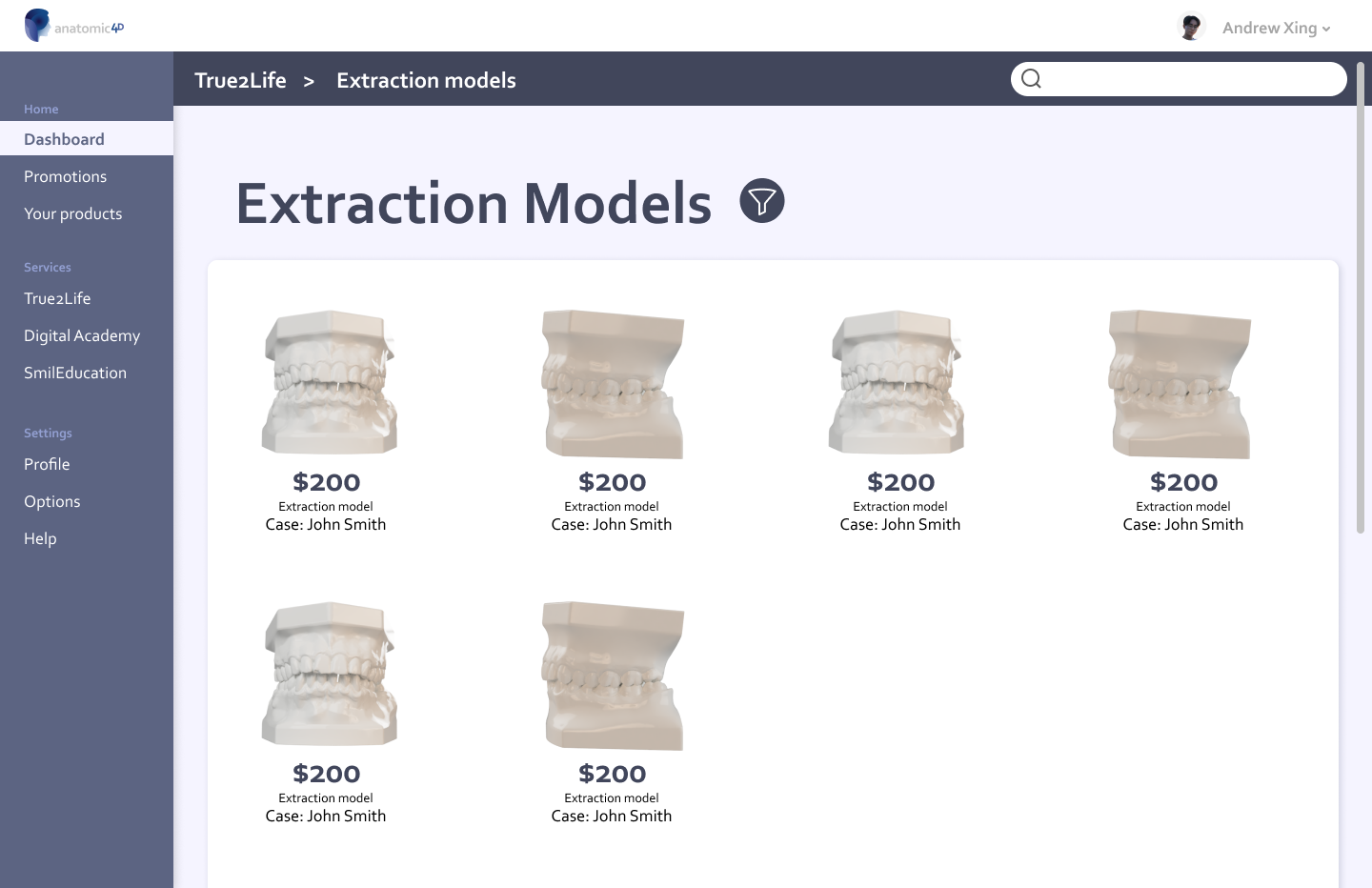
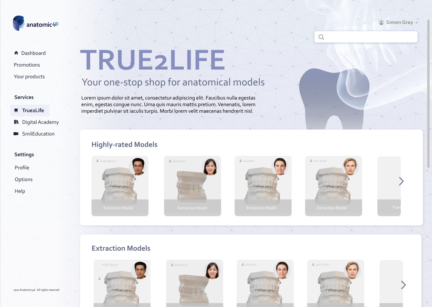
True2Life Shop
Students can shop for the models they need in this e-commerce store. The display was inspired by Amazon's homepage, and the other stores on the site, Digital Academy and SmilEducation, have been given similar but distinct colour schemes for differentiation
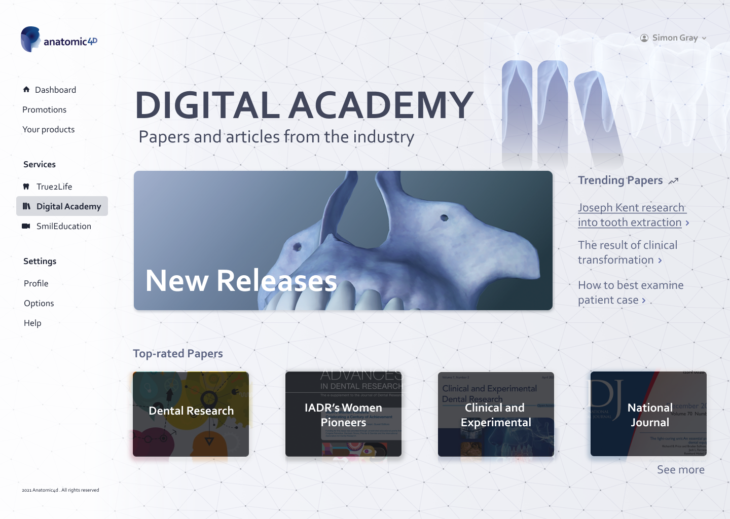
SmilEducation and Digital Academy Screens

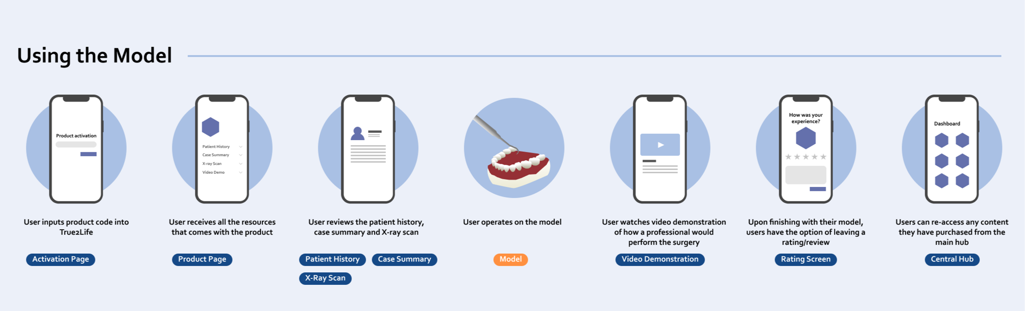
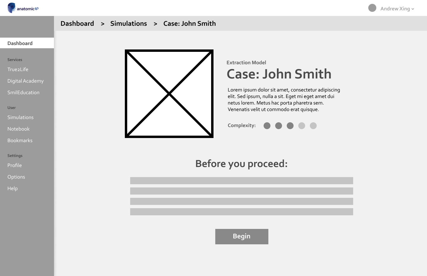
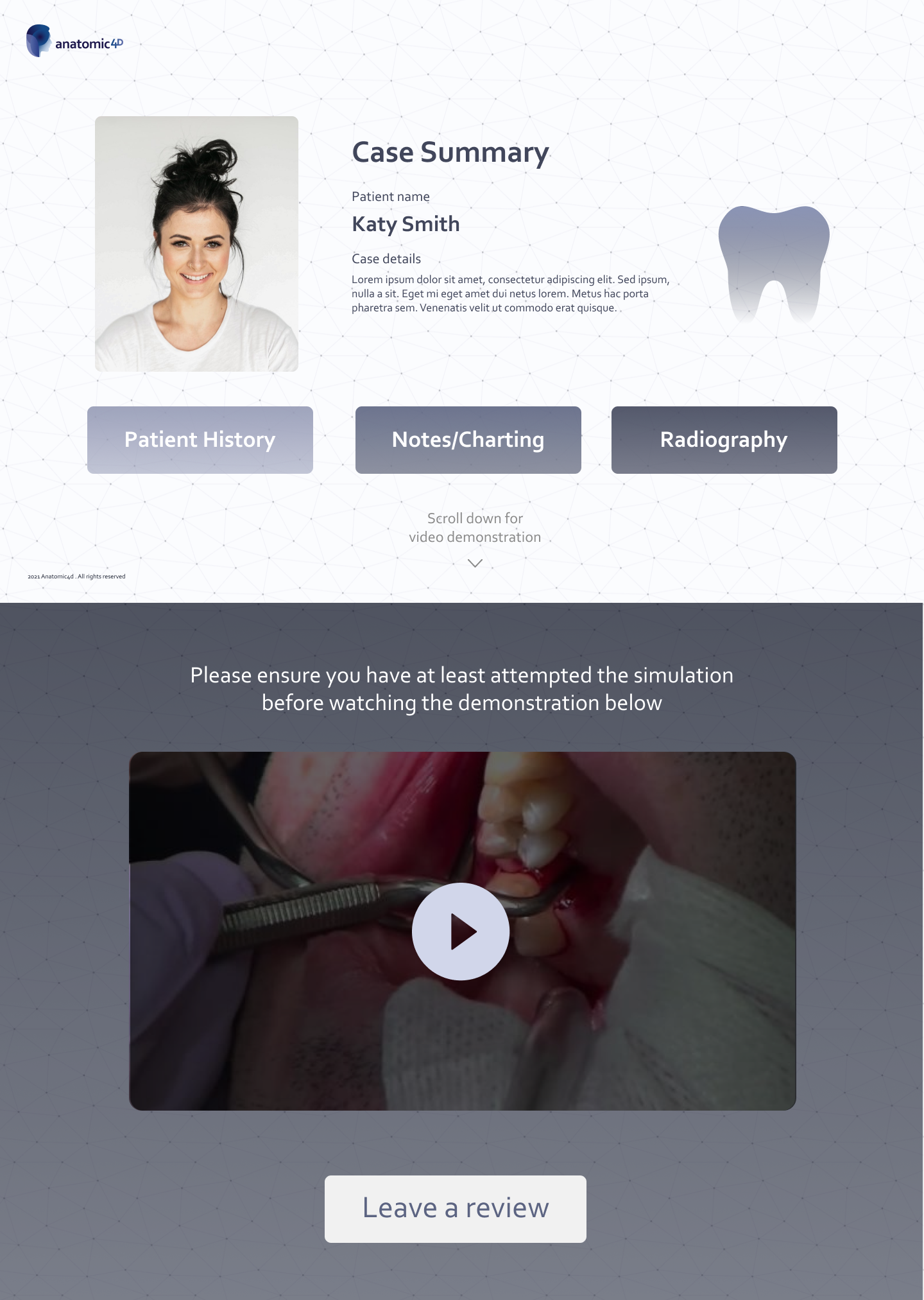
Simulation Screen
The simulation screen should have all information on a patient, including their history, notes and radiography. Rather than have it all on a page, I chose to have them appear in separate pop-up windows, simulating how real life cases would go, having your information spread out across a table
Project Reflections
Challenges
- Future versions and designs of Anatomic4D will reuse or be inspired by the designs I have created
Anatomic4D will potentially be used by dental students all around Sydney, so the designs I have created will be experienced by many
Impact
Collaborating with graphic designers to create beautiful, intuitive interfaces
Understanding important Figma functions such as components and variations
Finding my own design sense and style
What I learnt
Andrew Xing
UI/UX Designer based in Sydney
Copyright © 2024 Andrew Xing. All rights reserved.