Data Visualisation
Gun Violence Chart
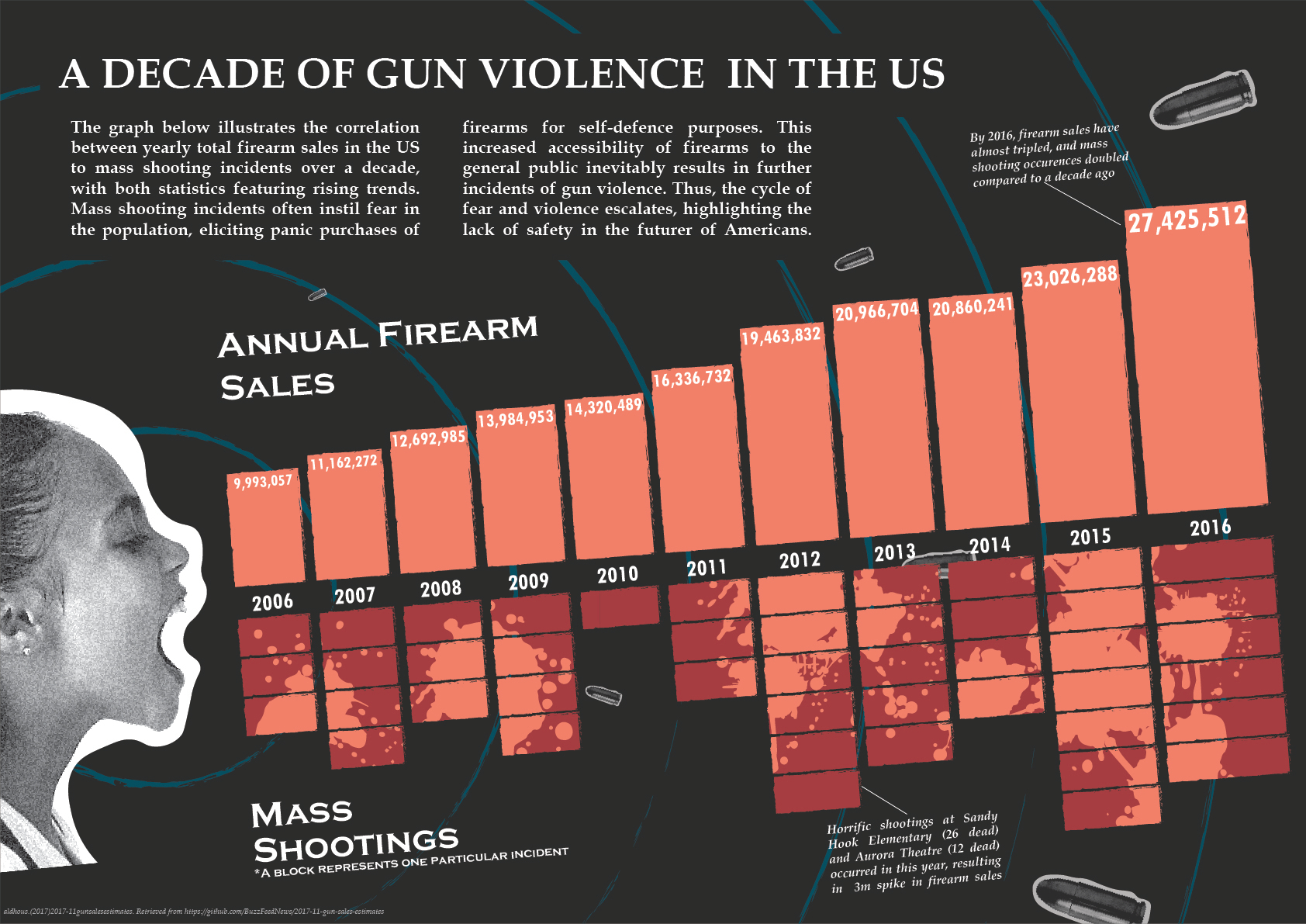
A data visualisation of the correlation between yearly firearm purchases to mass shooting incidents in the US, from 2006 to 2016. The datasets were organised and analysed on Microsoft Excel.
The visualisation does not shy away from its dark subject matter, and portrays the graphs as an escalating scream to call urgency to the matter.
Design Rationale
The dataset chosen revealed statistics on annual US firearm sales by state from 1998 to 2017, as well as every mass shooting incident from 1982 to 2017. I chose to capture and correlate the data of firearm sales and mass shooting incidents within a decade starting from 2006, and highlight the rising trends between both statistics. As the data touches on a very serious and severe issue, I wanted to convey the escalating urgency portrayed by the statistics through a dynamic illustration, as opposed to a simple, clean column graph layout, and play on the theme of fear. My final design features an image of a young girl screaming, with her rising volume depicted by the similarly-rising column graphs from the correlating data sets.
The design is purposefully made striking and unpleasant, reflecting the reality of the issue. The serif title is clear on setting the context and tone (Cullen, 2007), and bright, blood-like colours and graphics are implemented in the column graphs to ensure the statistics remain the main focus of the design by visually advancing from the dark background (Bosler, n.d.), as well as set a very grim tone. This effect is also achieved through using photos rather than illustrations for the girl and the bullet, recreating a harrowingly possible scene in real life (Bosler, n.d.). The blue concentric lines in the background are there not only to perpetuate the narrative of the screaming girl with its appearance as sonar waves, but also to visually guide viewers through the data (Cullen, 2007). In regards to the graph itself, the decision was made to omit a y-axis as it portrays two sets of data that are gauged differently, and would result in more visual clutter if forced, leaving just the year axis which is relevant to both data sets and ties them together. All of these elements together create a chilling but clear visualisation of two data sets which would otherwise be seen rather plainly.
In regards to the brief, I chose to lean more towards the story element of data visualisation as I found it difficult to create an engaging narrative with complicated statistics, resulting in a visualisation that is more focused on “sending a message” rather than effectively explaining detailed data sets. A particular critique that I have with my final design is that it is potentially too overcrowded with text and graphics, resulting in cognitive overload. An attempt to rectify this issue has been made by implementing the visual direction with the concentric circles and reducing graphic sizes, but more breathing space between elements would be desirable.
Andrew Xing
UI/UX Designer based in Sydney
Copyright © 2024 Andrew Xing. All rights reserved.