Website Design
Resbutler Website
I designed and developed briefs for a new website to replace the current Resbutler website in place, with updated styling and branding.
Since moving on, the site has been updated and rebranded as Wizbutler. Check it out here!
Design Brief
Design and implement a new website to replace the current Resbutler website, updated with modern styling and sleek branding.
Timeframe
2 months
Target Audience
Restaurant owners and management
"We clients to see us and know that we're the Rolls Royce of restaurant management software, that we're the best in the market."
My Responsibilities
I handled the design of the new website predominantly by myself, with regular input from my supervisor and the CEO. This project included:
Competitor Analysis
Researched competitor branding and websites, as well as other companies we wanted to align ourselves with.
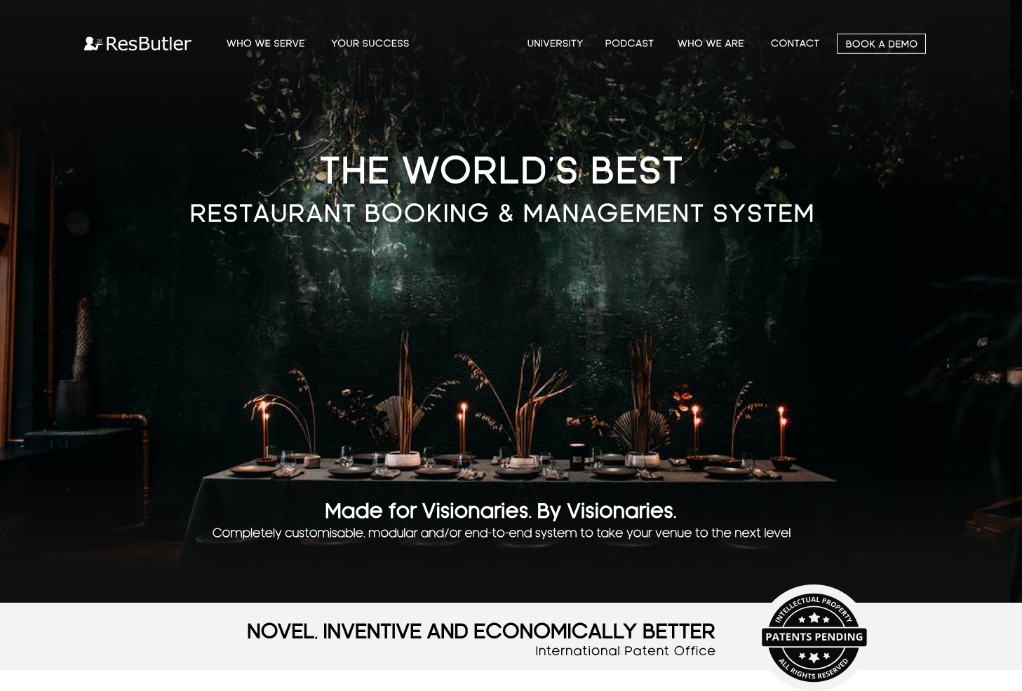
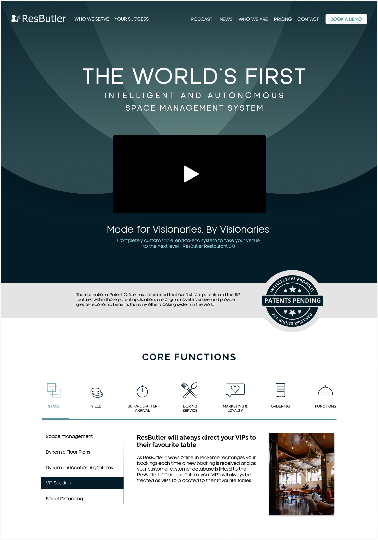
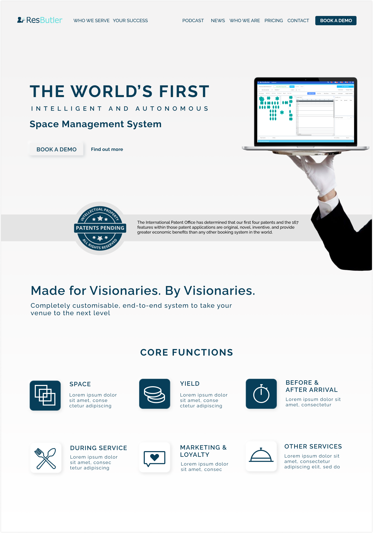
Website Design
Designed all facets of the website in Figma, including a new stylesheet, subpages and components.
Collaboration with Developer
Created briefs for the developer to follow, carefully communicating the designs to a precise level

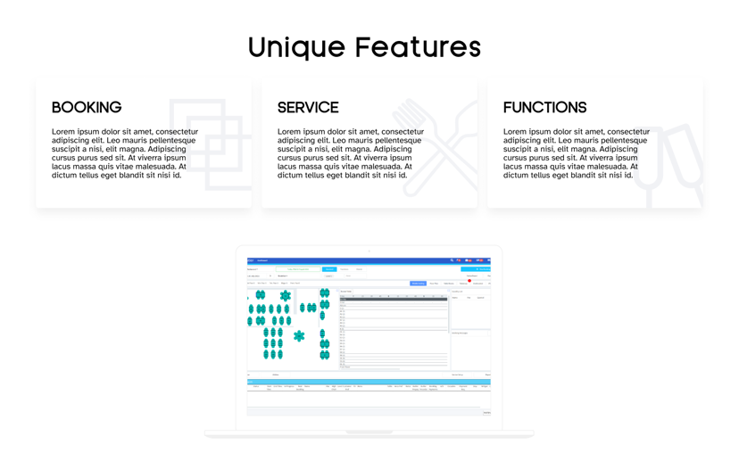
Final Screens
Design Process

Research & Concept Presentation
I researched competitor websites and generated some concepts to ensure our vision of the new website was aligned.

Design Iteration
I built upon and refined the chosen concept to be reflected across all areas of the website.

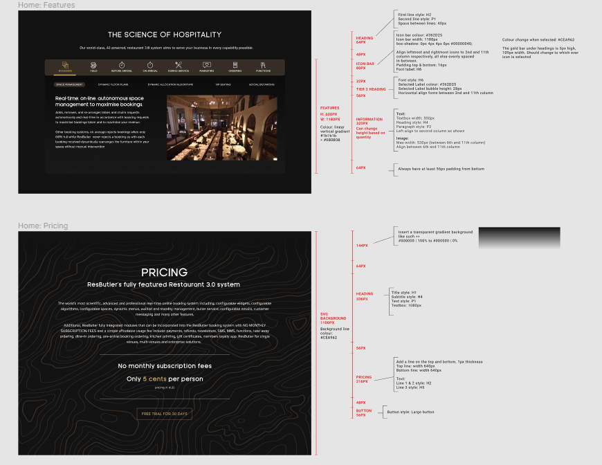
Creating Design Briefs
To ensure the designs were to be properly implemented into the site, I created precise briefs to be passed on to the developer.
1. Research & Concept Presentation
To begin the project, I conducted some user research on our competitors, generating a word cloud of key words from their site and comparing them to the values we wanted to align ourselves with. Additionally, I presented website screens from other visionary brands in separate fields to confirm the general look and feel we wanted our company image to move towards.
Following this, I came up with a few concept ideas to pitch to the CEO, each one honing in on a different facet of our vision. We decided to move forward with the first concept, which focused on sleek, minimal design.

2. Design Iteration
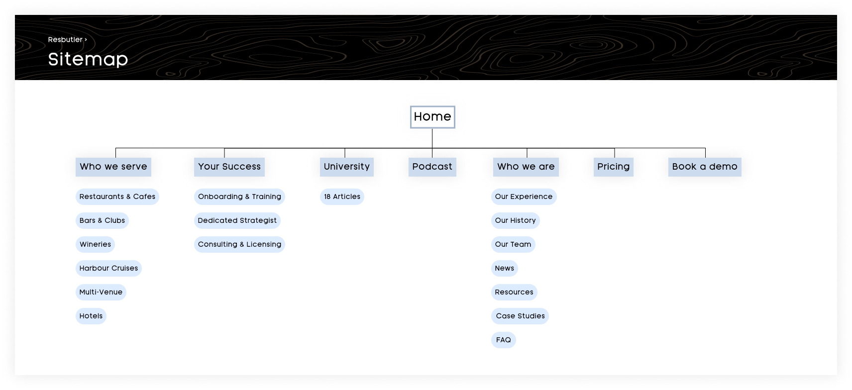
Sitemap & Style Guide
I created a sitemap based on our current website with minor updates to fully grasp the scope of the project. Additionally, I created a style guide which I constantly iterated upon to ensure all components across the site were consistently implemented.

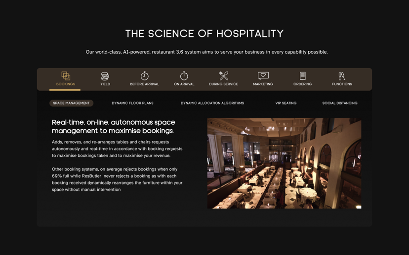
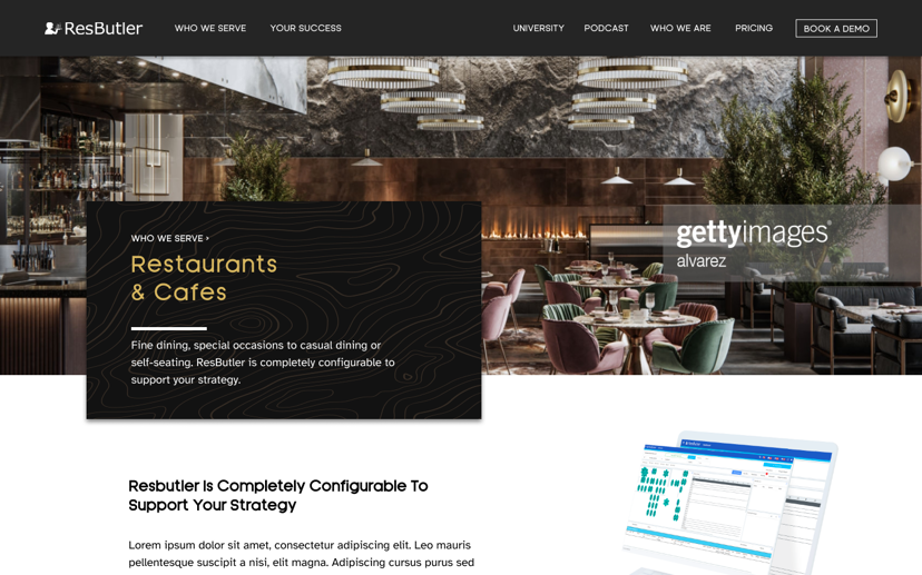
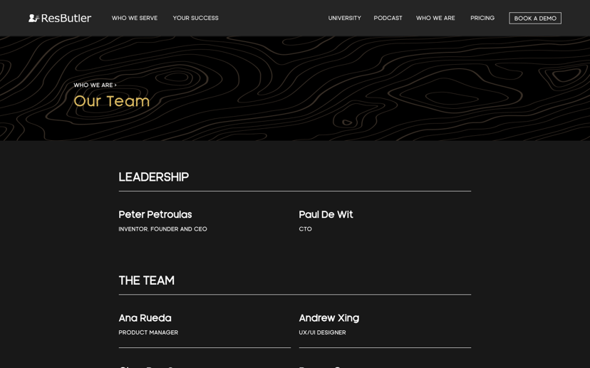
Component Design
I created a number of components, such as headers, CTAs, and information sections, to accommodate for the wide variety of needs for the company. Incorporating web design and UX design fundamentals, all components were designed to establish the company's image as a visionary brand.

3. Creating Design Briefs
To begin development of the new website, I created detailed briefs of the designs to be passed onto the developer. In addition to this, I also communicated frequently and had meetings with the developer to ensure all nuances were fully understood and applied.

Andrew Xing
UI/UX Designer based in Sydney
Copyright © 2024 Andrew Xing. All rights reserved.