Data Visualisation
South Korea Suicide Chart
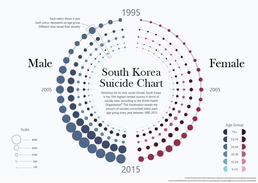
A data visualisation of all suicides that occured in South Korea, from 1995 to 2005. It aims to raise awareness on the key age groups affected, and the severity it has grown to over time.
The dataset was thoroughly analysed through the Exploratory Data Analysis process, which utilised software such as Microsoft Excel and Gephi.
Design Rationale
This visualisation is the product of many attempts to portray large amounts of data in minimal space, revealing data in an approach similar to that of scatter plots. The visualisation conveys four variables with its nodes in distinct ways: gender by set, year by position, age group by colour and suicide numbers by size, altogether revealing the severity of suicide numbers between age groups in South Korea.
Given the morose subject matter, a minimalistic approach was taken to visualise the data to ensure attention isn’t taken away from the chart itself. The narrative and theme of death is subtly contrived by the dull red and blue colours on the light background, which can be likened to bruises and blood clots on a dead body, and perpetuate the melancholy tone of the visualisation (Bosler, n.d.). Textual information is kept relatively scarce, and also given a darker shade of grey to remain unobtrusive from the data. The graph is explained with a single annotation, keeping chart junk to a minimum for a clearer visualisation (Bosler, n.d.).
The circular form of the chart serves many functions as a design aspect. It solves the aforementioned challenge of integrating the year variable in an organised fashion, whilst still being a unique, interesting visual, as opposed to a regular scatter plot. It utilises the growing intensity of the nodes to make efficient use of space, which was a challenge presented by our absurdly large column graph. Whilst in this structure, several principles of Gestalt Theory, such as proximity and similarity, can also be applied to the nodes to distinguish them from each other and allows them to portray each variable clearly (Wertheimer, 1938). As a final point, the concentric nature of the chart acts as a visual vector for the audience, being initially drawn to the title to understand the context, then to the chart around it (Cullen, 2007). The collaboration of these design details results in a visually aesthetic, yet clear and readable final visualisation.
The graph is explained with a single annotation
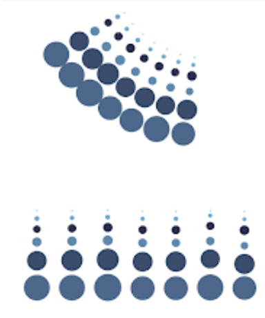
The growing intensity of the nodes is utiilsed to make efficient use of space
This graphic was conceptualized through the EDA (Exploratory Data Analysis) process for DECO3100 Information Visualisation Design Studio. View full report here
Andrew Xing
UI/UX Designer based in Sydney
Copyright © 2024 Andrew Xing. All rights reserved.